 |
| Ok - I made the best out of a bad situation. I'm a layer painter guy, always have been. I wash and drybrush and wet blend and use all kinds of techniques but I'd never "dipped", so I thought I'd give that a try on models I think are perfectly suited for it. |
 |
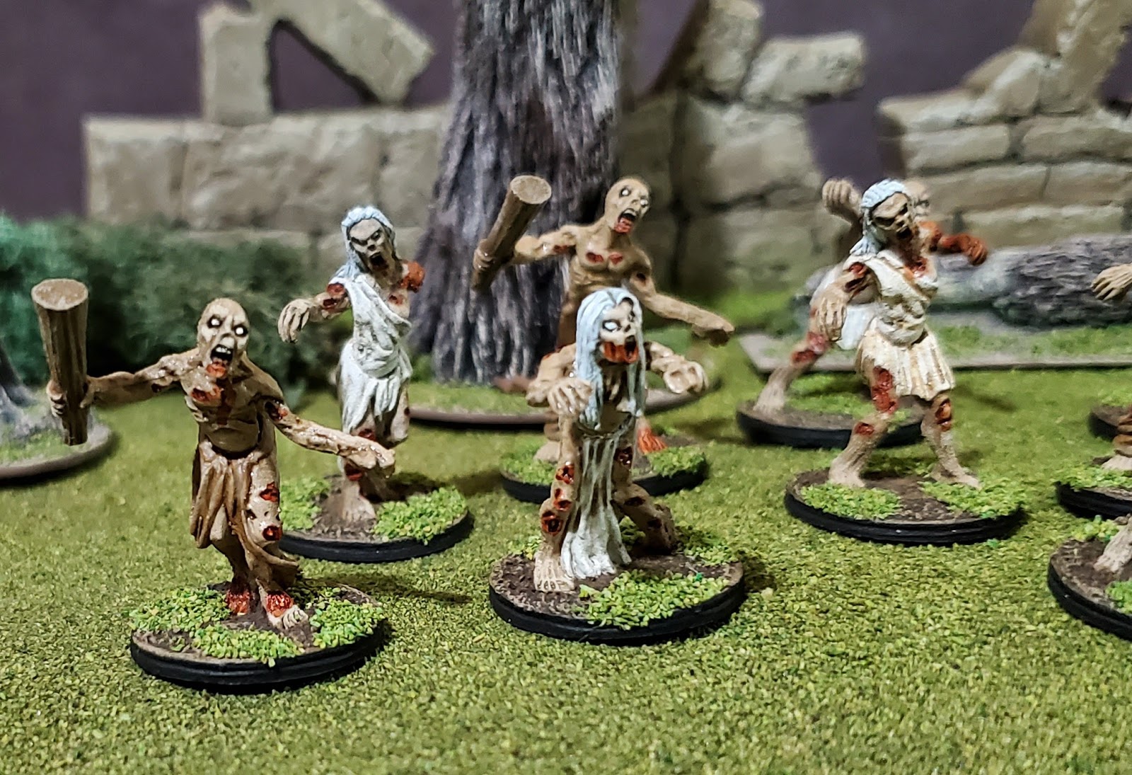
| These Blue Moon zombies aren't great models, have weird bases, and are simply skin and cloth - two have a club but the rest are unarmed and carry nothing but their wounds. I had assembled them years ago, but never got to them and figured dipping would be a perfect way to whip out forty models and not have to dwell on them excessively. |
 |
| Then in August last year, disaster struck! I thought I would prime them in their primary color as is the advice using Rustoleum Camouflage Tan (I've used the dark brown and love it). |
 |
| But it came out gritty and grainy and then wouldn't adhere, leaving highlights of metal visible wherever I handled them. A week or so went by so I washed them again and that seemed to knock off the loosest particles. Had tons of damp powder all over, but I brushed them off them let them dry again. I retrospect I think it was my fault - insufficient shaking and probably too hot of a day to spray. |
 |
| After knocking off the loose bits, maybe what remains can still work I figured. Luckily, Folk Art "Country Twill" is a near perfect match for this spray so I hand primed over all the metal bits, followed then by the Folk Art to make them again uniform. |
 |
| So far so good. There was still dusty miniatures to handle, but I then started to block in the colors. There's no real rhyme or reason to what they are wearing - just cloth, loincloths, "diapers" I've been calling them, dresses and skirts and what once were simple trousers. These are 2 part models and many of the tops were female and have to be matched up with the skirts. Most of the bottoms seem otherwise unisex. As it turns out one can get some cool models out of them. Of course these four in the front are my least favorite. |
 |
| There's basically nothing on them that tethers them to any definitive time period so I got to go very generic. Underlying the style was the impression to me that they are primarily wearing burial shrouds. Since they were buried, they may have died of natural causes or of old age, ergo, almost half are painted as if they were elderly - mostly the women models. |
 |
 |
| A quarter of them are bald so I just divvied up the remaining models in blonds and browns. |
 |
| Again, since there wasn't any identifiably modern clothing I blocked in off-white for most of the clothing. As I painted, the dustiness ebbed as I painted over it and knocked off the rest. (You can see the red brush-on primer on the bases here.) |
 |
| I did the clubs, the pants and the remaining clothes in "Dirt" then I dropped in some dark flesh on all the visible wounds. Incidentally, this work was done on the side over the course of several days. |
 |
| Nearing the end of blocking in the base colors |
 |
| I like the vacant blind eyes for zombies, popped those in and other details of revealed bones and organs, etc. |
 |
| Ok - colors are blocked in - ready to start dipping! |

| I used Pledge mixed with artists ink to suit. Plain brown turned out too "sepia" for me so I did a few in just black, then didn't care for that and did the rest in mostly black but with a few drops of brown in. I probably could do more to really enhance those shadows but the grit of the underlying primer was darkening everything more than I wanted to. To remedy - I went back in and painted the cloth again on the highlighted areas as well as the skin again focusing on the tops of the models. I quickly just dry-brushed toes and fingers to get the contrast to pop there. I don't love these guys so didn't want to spend yet more time on them so I was pretty sloppy. The Pledge base did add a smooth layer over everything so glad it also serves as a sealant. I think I'll still do a gloss and two matte coats after though just in case. |
 |
| My standard basing for non-urban zombies - no tufts or static grasses |


 |
| You can see the brown ink did nothing for the gray hair particularly so I went in and highlighted all those heads with off white and then white to bring the color back up. |
 |
| Why a tan undercoat? I always liked the look of the zombies in Resident Evil: Extinction (the Las Vegas one) - leathery, sun damaged instead of damp and moldy. Just mixing it up a bit. |

 |
| Less is more on the gore, but honestly the models have a billion wounds on them. If it's sculpted: I paint it. Here I just added old citadel Chestnut ink over all the wounds. |
 |
| Yes these models are pretty uniform in appearance and color. |
 |
| I don't like that the BM bases are framed in that band around the edges. Not pictured above is where I glued down some ballast in those corners to lessen the transitions there. Doing so improved it but not perfectly. The flock covered the worst of the little "steps" that remained and they are mostly invisible. |


 |
| Because of the framed bases I didn't do what I recommend EVERYONE do for the majority of their zombies: base them on multi-figure bases. Nobody likes moving all these around every turn. |
 |
| All and all, these are fine. I needed yet more zombies like a hole in the head, and what I thought would be a quick project took about twice the time I had figured. That said, I'm happy with them, they are rank and file, look great en masse and are, at last, off my painting table. |
Blue Moon has two other boxes of zombies - one that leans medieval the other in modern attire. I'll get to them at some point. Thanks for looking - questions, comments & followers are welcome and encouraged!